Scrapbooking Paper Types Explained
ScrapBooking >> Scrapbooking Supplies and Tools>> Scrapbooking Paper Types Explained
Scrapbooking Paper Types Explained
Last updated: October 23, 2026
Key Takeaways
- Scrapbooking paper usually falls into three practical groups: cardstock, patterned paper, and specialty paper.
- Cardstock builds the structure of a scrapbook page.
- Patterned paper adds theme, color, and movement to a scrapbook layout.
- Specialty paper adds effects that plain cardstock cannot provide.
Quick Answer
Scrapbooking paper types usually come down to three choices: cardstock, patterned paper, and specialty paper. In Scrapbooking Paper Types Explained: Cardstock, Patterned Paper, and Specialty Paper, the right pick depends on whether you need structure, decoration, or a special effect. A 12 x 12 inch sheet of 80 lb cardstock is a reliable starting point for most layouts.
Scrapbooking paper types are easiest to choose when I think in terms of job, not pattern. This Scrapbooking Paper Types Explained: Cardstock, Patterned Paper, and Specialty Paper guide keeps that rule simple: cardstock gives structure, patterned paper adds color and theme, and specialty papers like vellum, glitter paper, and foil paper add texture or shine where a flat sheet would feel plain.
The three paper types that do most of the work
Scrapbooking paper usually falls into three practical groups: cardstock, patterned paper, and specialty paper. Cardstock is the base sheet, patterned paper carries the design, and specialty paper creates a specific effect such as translucency, sparkle, or metallic shine.
That split matters because each type behaves differently under glue, punches, scissors, and photos. A 12 x 12 inch sheet of 80 lb cardstock can hold layers and photo mats far better than a lightweight printed sheet. Patterned paper is often thinner and more decorative, so it works well as a background or accent. Specialty papers are the least forgiving, which means they are best used in small doses.
A generic article often treats all scrapbooking paper as interchangeable, but a professional can help you choose the right sheet for the job. That leads to warped corners, weak mats, and layouts that feel crowded. I would not use glitter paper for every background, and I would not use patterned paper for every structural layer. The whole point is to assign one paper type to one job.
The easiest rule is this: use cardstock when the layout needs strength, patterned paper when it needs visual story, and specialty paper when one area needs emphasis. That keeps a page readable instead of noisy.
Cardstock: the backbone of a scrapbooking page
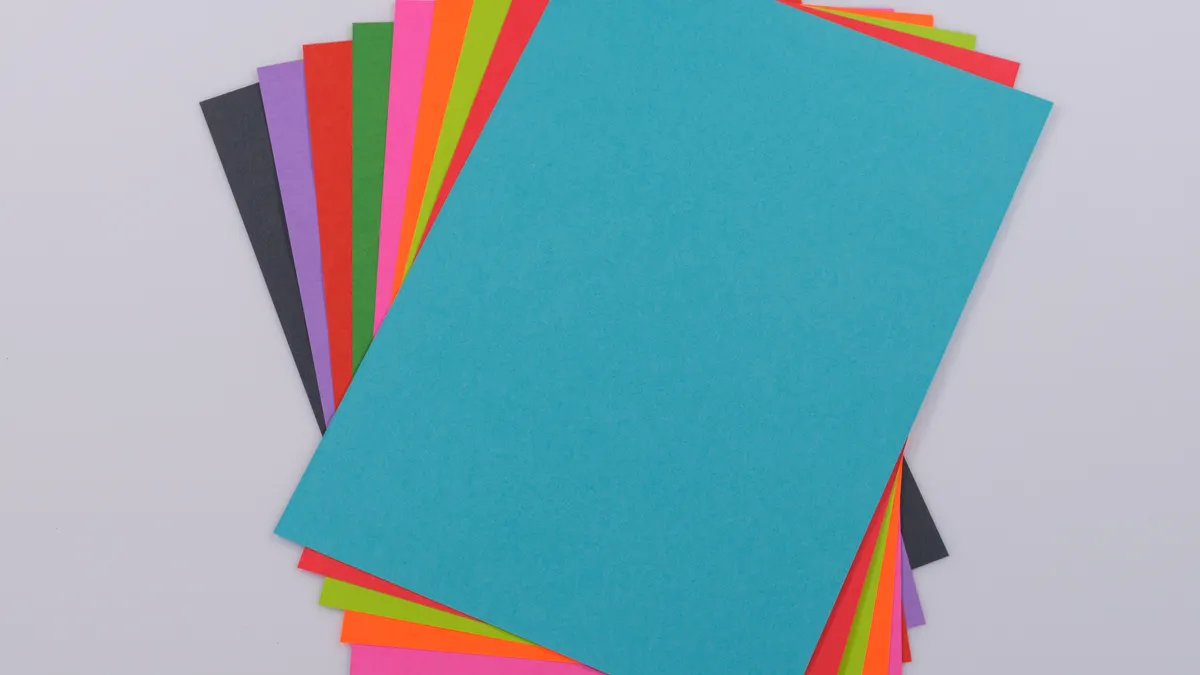
Cardstock is the paper type that gives a scrapbook page its structure. It is thicker than standard writing paper and usually sold in 12 x 12 inch or 8.5 x 11 inch sheets, which makes it the most useful base for mats, titles, die-cuts, and photo borders.
The phrase “paper weight” matters here because cardstock is not one fixed thickness. In craft stores, you will often see weight listed by pounds or by gsm, which means grams per square meter. A common scrapbooking range is about 65 lb to 110 lb, though packaging can vary by brand and by measurement system. Heavier cardstock resists curling better, while lighter cardstock folds more easily for cards or interactive elements.
Cardstock is also where finish deserves the most attention. Smooth cardstock gives clean cuts and crisp stamping. Textured cardstock can hide small flaws and add depth, but fine detail cuts may not look as sharp. If a title has thin lettering, smooth white or solid-color cardstock is the safer choice.
Here is the practical rule: use cardstock for anything that must stay flat, support layers, or survive repeated handling. That includes page bases, journaling blocks, photo mats, and sturdy embellishment shapes.
How to pick cardstock without overbuying
Start with three neutral sheets and three core colors that match the kind of pages you make most often. A neutral stack might include white, cream, and kraft. That gives enough flexibility for birthdays, travel, school, or heritage layouts without buying ten nearly identical shades.
Then decide whether you need smooth or textured cardstock. Smooth works better for printing, stamping, and neat edge trimming. Textured cardstock is more forgiving for busy hands and can make a simple layout feel finished without extra decoration.
Acid-free paper is worth checking on the package. Acid-free and lignin-free labels are common in scrapbooking because they help paper resist yellowing and deterioration over time. That matters most if the scrapbook is meant to be kept for years, not just displayed for a season.
If you want one dependable starting point, cardstock is the paper type to choose first. It is not ideal for sheer, airy effects, and it is not the best choice for a background that should look printed or illustrated. But for the backbone of a page, it does the job better than anything else.
Patterned paper: when the design should do the talking
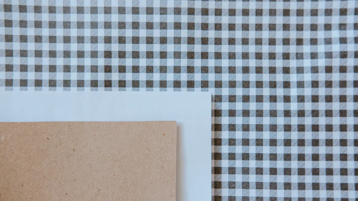
Patterned paper is the paper type that brings theme, color, and movement to a scrapbook layout. It is usually printed on one or both sides, and the scale of the print matters just as much as the colors themselves.
A large floral print, bold geometric repeat, or tiny scattered icon pattern each changes the mood of a page. Large-scale prints can overwhelm a 4 x 6 inch photo if they sit too close to it. Small prints are easier to use as backgrounds because they add interest without stealing attention. Double-sided paper helps here because one side can be quiet and the other can be more graphic.
Patterned paper is not always the best choice when the page already has a lot going on. If the photos are colorful, the journaling is long, and the embellishments are busy, a strong print can push the whole layout into visual noise. In that case, I would use patterned paper as a mat, strip, or border instead of a full background.
The useful habit is to check the paper from arm’s length before cutting. If the print still reads clearly from that distance, it can anchor the page. If it turns muddy or too fussy, save it for smaller pieces.
How to coordinate patterned paper with photos and cardstock
- Pick one dominant photo or cluster and decide its mood first. A beach photo, for example, can handle aqua, sand, and white much better than a dense red-and-black print.
- Choose one patterned sheet that supports the subject, not one that competes with it. A 12 x 12 inch floral can work as a background, while a 6 x 6 inch scale is often better for accents.
- Pull one solid cardstock color from the print and use it for mats or title blocks. That ties the page together without forcing a perfect match.
- Limit yourself to two or three papers in the same layout unless the design is very simple. Too many patterns make the page feel fractured.
- Repeat one color at least twice across the page so the eye has a path to follow. A navy border, navy title, and navy patterned strip will usually feel more intentional than isolated pieces.
A lot of beginners buy patterned paper for every sheet because it looks exciting in the pack. The problem is that full-sheet print can be harder to crop around. If the print is busy, use less of it. If the print is subtle, you can use more.
Patterned paper is not the best choice for anyone who wants a minimal, photo-led layout with almost no decorative noise. It is also a poor choice when the print has a strong directional design that will be cut awkwardly into small pieces. Even so, it remains one of the fastest ways to give a scrapbook page personality.
Specialty paper: vellum, glitter paper, and foil paper
Specialty paper is the category for effects that plain cardstock cannot give you. The most useful examples in scrapbooking are vellum, glitter paper, and foil paper, and each one solves a different design problem.
Vellum is translucent, so it softens what is underneath without fully hiding it. That makes it useful for layering over busy patterned paper, creating title blocks, or muting a photograph’s surroundings. It can look elegant, but it also reveals adhesive choices quickly, which means placement matters.
Glitter paper adds sparkle and catches light, but it usually sheds less than loose glitter because the finish is bonded to the sheet. It is best for small die-cuts, letters, stars, or celebration accents. A full 12 x 12 inch glitter background often overwhelms the rest of the page and can feel rough instead of festive.
Foil paper creates a metallic highlight. Gold, silver, rose gold, and copper finishes are common in craft supplies. Foil works well for titles, borders, and tiny shapes because the shine gives contrast without needing a second color family. Too much foil can look flashy in a way that dates the page quickly, so restraint helps.
The trade-off with specialty paper is control. These sheets are often harder to cut cleanly, may show fingerprints, and do not always feed neatly through a home printer. I would not choose them as the main background unless the whole design is built around that effect.
The best use of specialty paper is accenting a layout that already works. If the page is structurally weak, glitter paper will not fix it. If the color scheme is confused, foil will not rescue it. Specialty paper is there to finish a page, not start one.
Paper finish and weight change the result more than the print does
Paper finish and weight often matter more than the image printed on the sheet. A delicate script print on thin paper can buckle, while a plain solid sheet in the right weight can make the whole design look polished.
Finish describes the surface. Smooth finishes are good for crisp cutting, journaling, and printed labels. Matte finishes reduce glare, which helps if the page will be viewed under protective covers or displayed in bright light. Textured finishes give grip and a more handmade look, but they can make very fine embellishments harder to place cleanly.
Weight describes thickness and stiffness. In scrapbooking, that is the difference between a sheet that lies flat and one that waves after adhesive is applied. Lightweight paper is fine for layering, but if it is carrying a photo or a large embellishment, the edge may curl. Heavier cardstock helps the page stay flat, especially when a layout uses multiple layers on one side.
A practical comparison helps: a 20 lb office sheet behaves very differently from cardstock in the 65 lb to 110 lb range. The lighter sheet is more flexible and more vulnerable to tearing. The heavier sheet supports mats and title pieces. If a sheet is meant to be folded, heavier paper may crack unless it is scored first.
This is the section most generic guides skip, and it causes the most repair work later. People choose a pretty print and only later notice that it curls, cracks, or disappears under glare. Weight and finish are not extras. They determine whether the page feels sturdy or fragile.
How to choose the right paper type for the layout purpose
The right paper type depends on what the page is supposed to do, not on which sheet looks nicest in the stack. A title page needs stronger cardstock. A travel spread may need patterned paper with maps, tickets, or coordinates. A heritage layout often benefits from muted cardstock and a controlled specialty accent like vellum.
Use the following order when choosing paper for one layout:
- Decide the page’s main job, such as holding multiple photos, showcasing one photo, or supporting journaling. That tells you whether structure or decoration comes first.
- Choose the base. For most 12 x 12 inch layouts, that means a solid cardstock sheet in white, cream, kraft, or another neutral color.
- Add one patterned paper that reinforces the subject. A floral print suits a garden day; a map print suits travel; a subtle dot or stripe suits almost anything.
- Bring in one specialty element only if the page needs emphasis. A vellum layer under the title, a foil frame around a single photo, or a glitter shape near the focal point is usually enough.
- Step back and check whether one paper is doing too much. If the page feels busy at first glance, remove a print before adding more embellishment.
Paper coordination is easier when the colors repeat in small ways. A red pattern, red title, and red journaling line read as intentional. A red pattern with blue title and green border often reads as random unless the subject itself demands contrast.
This is also where acid-free paper matters again. If a project is meant to live in a scrapbook for years, the paper choice should support longevity, not just one afternoon of crafting. For standards and preservation basics, I would look at the guidance from the Library of Congress on preservation care, and for paper permanence terms, the American National Standards Institute is the standards body to know, even if the exact product label varies.
A lot of paper choices look fine in a stack and fail on the page. The fix is not more variety. It is picking one role for each sheet and stopping there.
Common paper mistakes that make a scrapbook page look cluttered
The most common scrapbooking paper mistakes are using too many patterns, picking the wrong weight for the job, and ignoring contrast. Those errors cost the layout its focus.
Too many loud prints make the page hard to read. If the background, mat, border, and title are all strong patterns, the photos disappear. The fix is to assign one sheet the lead role and let the others support it. One large print plus one solid cardstock is often enough.
Using thin paper for a structural layer is another problem. A lightweight sheet under a heavy photo cluster can curl at the corners, especially if adhesive is applied unevenly. Replace it with cardstock or at least a sturdier mat.
Choosing paper only by color can also backfire. Two sheets may look similar in the pack but behave very differently once cut. One may be smooth and bright; the other may be textured and dull. That difference can break the balance of the page.
Another mistake is treating specialty paper as a substitute for design. Glitter paper does not automatically make a layout festive, and foil paper does not automatically make it elegant. Both can look cheap if used in oversized pieces. Smaller cuts usually age better.
A final mistake is skipping acid-free paper for long-term keepsakes. If a scrapbook is meant to preserve family photos or important memories, that is not the place for random office stock. Choose materials labeled for archival or acid-free use when longevity matters.
The simplest fix is to edit harder. Fewer sheets, better contrast, stronger weight choices, and one deliberate specialty accent usually beat a crowded stack every time.
What paper should I buy first if I am starting a scrapbook?
Buy cardstock first, then add patterned paper later. Cardstock gives you a base for 12 x 12 inch layouts, photo mats, title blocks, and layers that need to stay flat. A small starter stack in white, cream, kraft, and one or two matching colors will cover more projects than a large pile of prints.
What paper is best for scrapbooking?
Cardstock is the best all-purpose paper for scrapbooking, and patterned paper is the best paper for adding theme. Cardstock handles structure, while patterned paper supplies color and personality. If I had to choose only one, I would pick acid-free cardstock in a medium-to-heavy weight because it supports more layout types than any other single sheet.
Drafted with AI; not yet reviewed by a person.